A Primer on the Healthcare Cost and Utilization Project (HCUP)
- Lipsa Panda
- Dec 30, 2021
- 6 min read

Overview
The HCUP Project is a set of databases and software tools that enable research on healthcare outcomes and access across the nation. Healthcare data is typically silo-ed between payers, providers and other data organizations. This project represents a joint federal/state/industry partnership to create a shared longitudinal collection of all-payer encounter records that start in 1988 (3️⃣3️⃣ years‼️). In co-locating this data and making it queryable, they want to understand the issues with data collection and integrity so that they can collaboratively improve it by creating data standards.

See below for a list of states that participate in the development of HCUP databases.

Fast Facts
4️⃣8️⃣ States (+DC) provide Inpatient Data
3️⃣5️⃣ States (+DC) provide ASC data
4️⃣1️⃣ States (+DC) provide ED data
Lots of statistical tutorials and dataset use guidance (ex. there's a tutorial which "introduces users to the sampling design, key data elements of the NRD and steps through an example of producing national readmission rates for a specific condition.")
Ok – I’m interested 😳. What should I know next? There’s two things I want to take you guys through
1️⃣ the data available through this project as well as
2️⃣ the software tooling that they’ve made available to interested parties who don’t want to pay for the underlying data but just want high level summary statistics about it. Lastly, I’ll try to take you through a data story with the data.
Data
What's included?
There are 5 databases (depicted below) that are variously either available at the national and the state level or both.

These databases contain relational rectangles of information much like fact and dimensions tables in your typical health analytics warehouse. The documentation for how these tables are connected are meh but descriptions of individual columns are pretty 🔥 .
Each data dictionary is linked by variable to the methodology used to generate it, the range of values within it and descriptions of those values as well as what years they are populated for. Heavy RESDAC vibes here.


I would say the special sauce added here are all the AHRQ comorbidity metrics, and clinical classifications that help enrich the observations and add context and meaning. For instance you can take a discharge level dataset and, without looking at any ICD codes, understand the severity of that patient at discharge (i.e. with flags for obesity, hyperthyroidism, CHF, mortality level, mortality scale, resource demand, stage of principal disease etc). This, as you can imagine, enables risk stratified cost and utilization analyses across hospitals nationwide.
Usability
The most important limitation is that the website looks like it was designed in 1998 with EMACS*. I mean, it’s 2022, give me scrollytelling.

*Full disclosure: I love EMACS.
But you're probably more interested in the fast and dirty on their data. A massive treasure trove of de-identified data? What's the catch here? Well..
This data does not include services provided in physician offices, complete pharma, lab, pathology or radiology records. This makes it really hard to use this data for anything but readmissions, ED type outcomes analysis.
You need Data Use Agreement (DUA) Training and to sign a DUA to purchase and use the HCUP databases.
This data is released annually so it's not great if you need it for urgent analyses like a global pandemic.
They are not cheap!
The data are sparse (not every state/year combination exists for instance) and data elements have pretty high missing rates (like the TOT_CHARGES variable). Though they do have primers on how to handle that missing data in your analyses.
I get HTTP errors on their site wow let me please fix this
The Bright Side 🌞🌻🌸
They don't look that hard to download if you do purchase them and they seem to be delivered promptly.
Their FAQ document is so thorough it took me hours to get through.
There’s so much spend concentrated in inpatient, asc, and ED settings that this is a pretty meaty database to explore regardless.
Still, onwards to the tools they built to make data exploration easy.
Data Exploration Tools
What's included?
One of HCUP’s stated goals is to facilitate the use of their data so they have built this wild data exploration tool which allows you to play with summary statistics and generate charts on their data. It also looks like it was made in the early 2000s (slight improvement I will grant you that).
HCUPnet is a free, online query system that provides statistics and data tables based on HCUP data. Its easy, step-by-step process allows users to explore many healthcare topics relating to hospital inpatient services and emergency department settings.

Using this tool, you can create cute little cross-tables 📶 of outcome measures you may be interested in (like number of discharges, or deaths, length of stay, % admitted from ED) against patient and hospital characteristics within a care setting. For instance, I can use this find the number of hospital discharges stratified by age group or the regional in-hospital mortality rate of diabetes patients in 2018. The possibilities are endless! (actually finite tho).


They also have these interesting statistical briefs which are little snippets on useful healthcare heuristics. Each report and corresponding set of infographics or findings at a glance are briefs on health policy cost and outcomes issues. Take a look here for the full list.
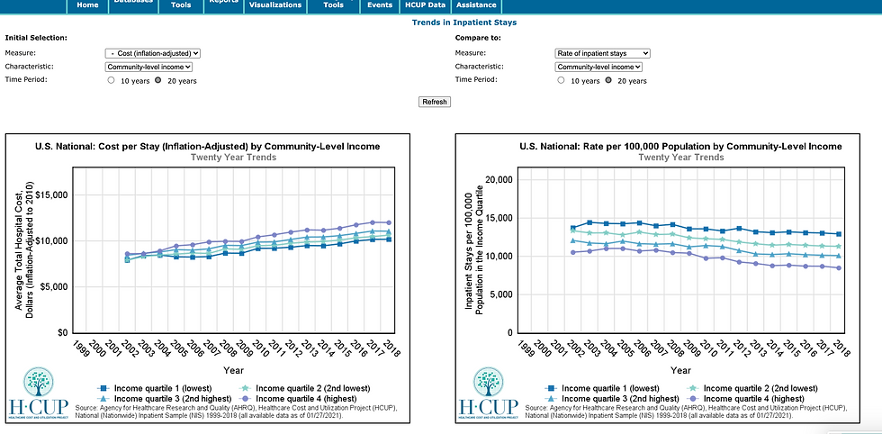
The search functionality is also pretty interesting. Searching for cost led me to one of their “fast stats” interfaces for reviewing cost trends over the past 20 years. Within a few clicks I went from searching “cost” in a search bar to this which is an interesting take on data search capabilities. Here I can see that cost per stay has been rising since 2002 while the rate of inpatient stays has actually been declining. Nothing surprising but I find comfort in stats that are not surprising.

Usability
I’ll be honest, I think the data exploration tool showed a lot of promise and then fantastically under delivered. I mean it has been redesigned but you really need to know what you’re looking for and be very well versed in the underlying data to get meaningful data stories out of it. Here’s a chart for instance that made very little sense to me.

That being said, you can do a lot to gain better heuristics around national health outcomes that you can then take away for casual cocktail conversation or benchmarking for your own analyses at work.
(Is it believable that I’m seeing 110% mortality rate in my diabetic population at Payer X where I work? No, Lipsa, you dolt 🐏)

For instance, I set out to look at anything I could learn about mortality rates related to inpatient stays for diabetic patients (where the principal diagnosis is related to diabetes – I think, or at least tried, to exclude patients with other severe comorbidities). This part was frustrating because the UI is such that anytime you wanted to add a variable, you had to re-run a query that reloaded the whole page but eventually I got to this.


Interesting to see that the South has some of the highest rates of inpatient deaths where the principal diagnosis was diabetes with complications and that the vast majority of those deaths were admitted from the ED.

And then I lost the website because my session was going to time out in 2 hours and I couldn’t get rid of the modal?? Jeez what’s a girl gotta do to screenshot some data. 🧐🥸
Summary, TLDR, Conclusion, The end of Lipsa talking
Overall, this is a really cool application of public/private partnership to create a store of longitudinal healthcare outcomes. I really do genuinely wish that the user interface was actually better to use than it was -- needs to apply some standard website design principles but I sincerely appreciate the effort seeing as how I spent several years downloading, wrangling and summarizing the raw datasets and putting them into goofy looking matplotlib charts in jupyter notebooks.
I appreciated the level of effort put into cleaning and classifying the clinical conditions and procedures for all the diagnoses and the level of effort put into data literacy. Data literacy is at the heart of this public health tool because every chart and statistical brief has like 3,000 asterisks behind it and 10,000 warnings about how to interpret this data. I appreciate you, whoever did this.
Anyway, hope you learned something about the history of HCUP, what it has in it and most importantly, the level of usability of the data and the tooling around it. I encourage you to play with the public tooling yourself and hopefully you will have enough information before spending $600 to $1000 of your hard earned money to pay for the dataset. Thanks!

Comments